
12 Google Display ad examples with banner layouts and copy
A useful Google Display ad shows what you offer, gives one clear reason to care, and points to the next step. Start with a product image, a short benefit and a matching call to action. Build the layout for each banner size. If you use responsive display ads, supply clean images and separate text assets instead of uploading the finished banner as the image.
Below are 12 original Google Display ad examples with sample copy, layout sketches and notes on when to use each one. They cover products, software, services and educational offers. The businesses, prices and product details are illustrative; these are teaching concepts, not live campaigns or measured winners.
Start here
- For a first product ad: use one item and one benefit.
- For software or a service: show a specific task or a clear booking step.
- For a set of banner sizes: preserve the offer and rearrange the elements. Shrinking a tall design into a narrow strip makes its details unreadable.
- For responsive ads: prepare clean product or service images, headlines and logos separately.
Contents
- Which kind of Google Display ad are you making?
- 12 Google Display ad examples
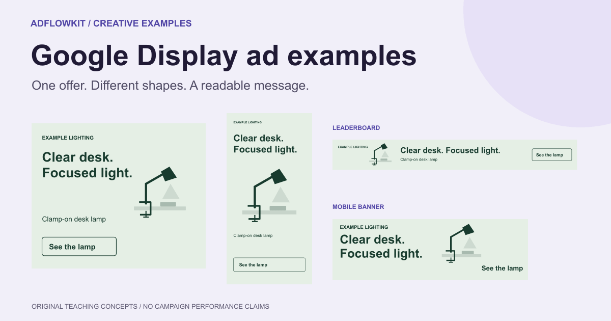
- One offer in four banner sizes
- Rewrite a vague banner into a clear offer
- Turn a finished-banner idea into responsive assets
- A creative brief you can use
- Evaluate the ad beyond its click rate
- A practical upload checklist
- Common questions
Which kind of Google Display ad are you making?
The word “image” can refer to a complete ad or to one component of an ad. Decide which you need before making the artwork. The gallery focuses on complete, uploaded banner concepts; a later section explains how to translate the message into responsive assets.
| Ad type | What you supply | What to design |
|---|---|---|
| Uploaded image ad | A complete image in a supported banner size | Product or scene, brand, message and contextual CTA within the finished composition |
| Uploaded HTML5 ad | A supported ZIP creative for an eligible account | A complete ad with any supported animation or interaction, checked against the HTML5 requirements |
| Responsive display ad | Separate images, headlines, descriptions and logo assets | Clean images and text that remain meaningful in different combinations |
Google's uploaded display specifications allow GIF, JPG and PNG image ads up to 150 KB. HTML5 ZIPs have a separate 600 KB limit and account eligibility requirements. These limits are not interchangeable with responsive image-asset limits.
Campaign setup note: Google's current display guidance says Display campaigns are moving to Demand Gen, with voluntary migration for eligible advertisers beginning in June 2026. Check the formats and creation options available in your account. This guide explains creative preparation; the campaign menu may differ during the transition.
12 Google Display ad examples with copy and layouts
For a closer look at color and product placement in sourced artwork, explore our creative banner design ideas. Compare the visual techniques with the message-led layouts below.
For each concept, choose the message first and check the destination before building the size set. The drawings illustrate composition; use accurate product photography, approved brand assets or a readable screenshot in your own ads.
1. One product with a visible benefit
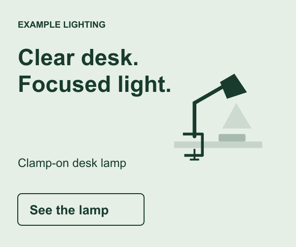
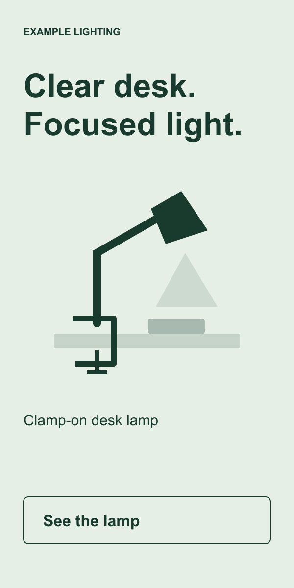
Banner copy: “Clear desk. Focused light.” Support: “Clamp-on desk lamp.” CTA: “See the lamp.” Destination: The exact product page, with fitting details and dimensions.
Use this for a product whose main benefit can fit in one phrase. Show the lamp attached to a desk so a viewer can understand what “clear desk” means. Give the product enough room that it does not become a small decoration beside oversized copy.
What to borrow: A direct connection between the picture and the promise. If you sell a folding table, show the folded state or the space it occupies. A generic room photograph would make the reader work harder to identify what you sell.
2. One detail that helps someone compare
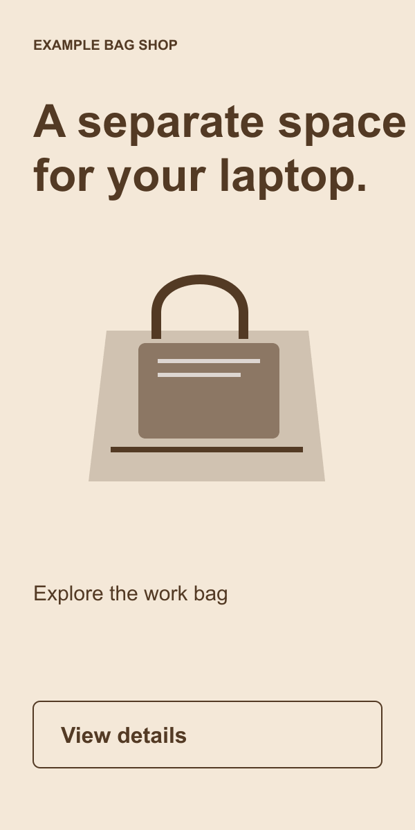
Banner copy: “A separate space for your laptop.” Support: “Explore the work bag.” CTA: “View details.” Destination: The bag page with compartment measurements.
Use a detail-led layout when shoppers need evidence of fit or construction. Put the compartment in the center of the image and keep the headline nearby. A tall format gives you room for a close-up and a short explanation.
What to borrow: Show the feature that matters to the decision, rather than filling the available space with more features. Only claim a device fits after checking its dimensions. For a narrow banner, use the product name and a shorter version of the benefit.
3. A product shown in use
Visual: A watering can beside indoor plants, with the spout reaching a small pot. Banner copy: “Reach the smaller pots.” Support: “Long-spout watering can.” CTA: “Explore the can.”
Choose this when a use scene explains the design. Photograph the action clearly: the shape of the spout and the pot should remain recognizable after export. Keep decorative props from competing with the item for sale.
What to borrow: One visible use, supported by a product-specific line. Lead to the pictured product, not a homepage that makes the reader search for it. If you also need a responsive image asset, retain a version of the photograph without the banner text or CTA artwork.
4. A price that includes its context
Visual: A notebook set with the included items visible. Banner copy: “Three notebooks. $24.” Support: “The weekly planning set.” CTA: “See the set.”
Use price when the offer is simple enough to explain at banner size. Keep the quantity beside the price so the customer knows what the number buys. A product photo should support the same set, with no extra props that look included.
What to borrow: Price plus scope. Replace the sample with your actual currency and conditions. If shipping, region or a subscription changes the amount, explain the important terms. Avoid a headline price that becomes a different offer after the click.
5. A kit for a defined task
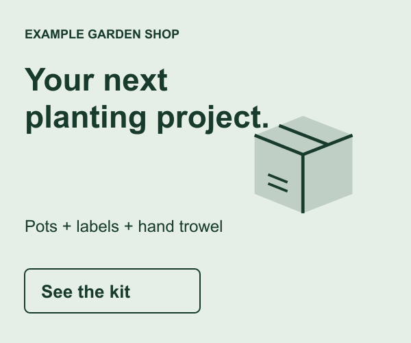
Banner copy: “Your next planting project.” Support: “Pots + labels + hand trowel.” CTA: “See the kit.” Destination: A kit page listing the included items and price.
Choose a kit when customers would benefit from buying related items together. The composition should make the contents easy to count and recognize. Use a compact group in a rectangle; shorten the item list in smaller formats and let the destination explain it.
What to borrow: A clear task and a visible group of products. Do not add “save” or a struck-through price unless you can support the comparison. A bundle can offer convenience without claiming a discount. For a Black Friday version, the Black Friday offer planning guide explains how to define the price, eligible products and terms before designing the banner.
6. A software ad about one task
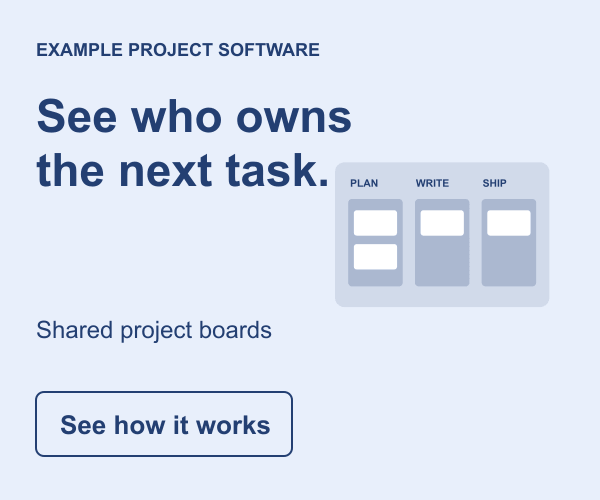
Banner copy: “See who owns the next task.” Support: “Shared project boards.” CTA: “See how it works.” Destination: A demonstration of task assignment.
A task-led ad can explain unfamiliar software without a long feature list. Show the relevant part of the interface, using readable sample data. The headline should tell the viewer what to look for, such as an owner beside each task.
What to borrow: A claim the interface can demonstrate. Remove unreadable sidebars and unrelated controls from the screenshot crop. Do not turn a simple task example into an unsupported promise that every team will save a fixed number of hours.
7. A guide that answers a buying question
Visual: A page from a desk-measuring checklist. Banner copy: “Measure before you choose.” Support: “A guide to desk dimensions.” CTA: “Read the guide.”
Use an educational offer when readers need help before choosing a product. Show a real preview and name the question the resource answers. The guide should help the reader make the decision, including when your product may not fit.
What to borrow: A narrow, useful topic that leads toward the purchase. For a static uploaded image, avoid a fake download control or system-style icon. Google's misleading ad design policy specifically lists download or install buttons in image ads. A contextual invitation to read the guide communicates the destination without pretending to be an operating-system control.
8. A service and its booking step
Visual: A real technician beside the equipment used for the job. Banner copy: “Bike servicing in Leeds.” Support: “Check service options and appointments.” CTA: “View appointments.”
Use this for a service with a defined coverage area and a destination that can handle the next step. The area and service are more useful than an unexplained brand slogan. Show the work or the people who perform it.
What to borrow: The match between the promise and the booking path. If the customer needs a quote first, say “Request a quote.” Do not show “Book today” when the destination only collects a general inquiry and provides no appointment.
9. An answer to a product objection
Visual: The lamp clamp fitted beside a close view of the desk edge. Banner copy: “Check the fit before you buy.” Support: “See clamp dimensions.” CTA: “View measurements.”
Choose this when customer questions show that fit or compatibility blocks the purchase. Show what the customer needs to check, then make that information easy to find on the landing page.
What to borrow: A specific answer to a specific concern. “Fits every desk” would overstate what a clamp can do. A measurement guide lets the customer decide with the relevant facts. Do not hide a necessary condition in text that becomes unreadable in the smallest banner.
10. A brand introduction with a product category
Visual: The notebook range with one notebook open. Banner copy: “Paper for plans and sketches.” Support: The brand name. CTA: “Explore notebooks.”
Use this when introducing a brand to people who may not recognize its name. A product category and a use give them a reason to investigate. Keep the brand visible, while leaving enough room for the item that explains the business.
What to borrow: An introduction someone can understand without previous exposure. An abstract slogan can support an established brand, but may leave a new viewer unable to identify the offer. Match the collection page to the range in the creative.
11. A product reminder with helpful information
Visual: The work bag with its available colors. Banner copy: “Find your workday color.” Support: “Explore the everyday bag.” CTA: “Compare colors.”
Use a reminder in a remarketing setup that your account and audience permissions support. Keep the message useful on its own; it should not need to announce that you know someone visited a page. Confirm stock and show the current product.
What to borrow: The same product with new decision-helping information. A static reminder is not dynamic remarketing. A feed-based campaign needs its own feed, event and campaign setup; exporting a banner set does not create that system. Google explains that process in its dynamic remarketing setup guide.
12. An offer that helps someone evaluate the product
Visual: A sample project board and a small preview of a product tour. Banner copy: “Take a look before you choose.” Support: “Explore the project board demo.” CTA: “View the demo.”
Choose this when buyers need to understand the product before speaking to sales or starting a trial. Name what the demonstration contains. If it is a recorded walkthrough, link to that; if it is a scheduled call, describe the booking step.
What to borrow: A next step that matches the actual commitment. “View the demo” should not unexpectedly become a sales form with no demonstration. Avoid a fake play button in a static banner; use contextual copy to explain what opens after the click.
For seasonal versions of these layouts, see the Christmas ad examples, which cover sale, gift guide and delivery-deadline banners. To choose a visual direction before adapting a layout, browse the Christmas creative styles and concepts.
One offer in four Google Display banner sizes
Take the lamp concept from example 1. The offer stays “a clamp-on lamp that leaves desk space clear.” The product, brand and destination also stay the same. The size changes how you arrange and edit the information.

| Format | Keep | Rearrange or remove |
|---|---|---|
| 300 × 250 rectangle | Brand, two-line benefit, product and CTA | Use the product beside or below the message; keep one short support line. |
| 300 × 600 half page | The same promise and product identity | Use a larger product view and place the CTA below it. Add detail only if it helps the choice. |
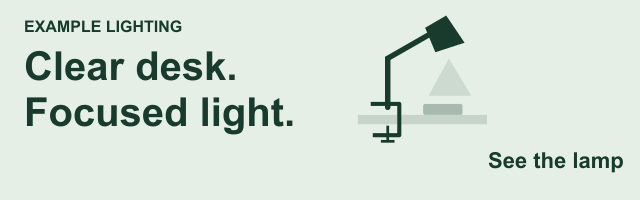
| 728 × 90 leaderboard | Brand, compact headline and clear action | Arrange elements horizontally. Drop the secondary sentence before reducing all the text. |
| 320 × 100 mobile banner | A recognizable product and brief benefit | Use a close crop and short action. Remove detail that cannot remain readable. |
These are supported size examples, not a promise that four formats cover a particular share of impressions. Select sizes using your campaign needs and account options. The Google Display banner sizes guide has the dimension reference; this article focuses on the composition.
Inspect the exported file at its intended pixel size. A headline that looks readable on a zoomed design canvas may fail in a small banner. If a qualifier is necessary to understand the offer, keep it readable or simplify the offer so it fits.
Export, check the file size, then inspect the compressed result. Fine product detail and small type can degrade during compression. For the uploaded image formats covered here, the 150 KB cap applies to each file. Do not assume that a blog illustration or an uncompressed design file is an upload-ready ad.
Rewrite a vague banner into a clear offer
Vague version: “Illuminate your potential. Discover next-generation excellence.” A viewer cannot tell whether you sell lighting, training or software. A generic background would leave that question unanswered.
Specific version: “Clear desk. Focused light.” Show the clamp-on lamp in use, name the product and use “See the lamp” as the action. The product page should show how the clamp attaches and which desk thicknesses it supports.
For a leaderboard, reduce the line to “Light for a clearer desk.” For a tall banner, retain the main line and show more of the lamp. You have changed the wording to fit the space while preserving the benefit. You have not introduced a second offer.
Before choosing a clever headline, ask whether a new viewer can name the category, the reason to consider it and the next step. If any answer is unclear, revise the copy or the product image.
Turn a finished-banner idea into responsive assets
Google assembles responsive display ads from separate assets. A finished uploaded banner contains its own layout, while a responsive image contributes to a layout Google creates. Google's responsive creative guidance recommends avoiding overlaid text, logos and button graphics on the main image. This is creative guidance for that asset type, not a universal ban on text in every uploaded banner.
For the lamp concept, prepare this asset bundle:
- Image: An accurate photograph of the lamp attached to a desk, with a natural setting and no added headline or CTA.
- Short headline: “Light for a clearer desk” (24 characters, including spaces).
- Long headline: “A clamp-on lamp that leaves more room for your work.”
- Description: “Explore the lamp, check the fitting and choose a finish for your desk.”
- Logo and business name: Your approved brand assets, supplied in the appropriate fields.
- Final URL: The same lamp product page used for the uploaded-banner concept.
Google's responsive display specifications list short headlines of up to 30 characters and long headlines and descriptions of up to 90 characters. Check the asset fields and accepted image ratios in your account before producing the set. The wording above is illustrative copy, not a claim about a real lamp.
Write each headline so it makes sense without the others. Avoid “Here's why” if the reason appears only in another asset that may not show. Keep the product and important parts of the scene inside a crop that still communicates the message in the previews.
Performance Max needs its own asset review. It is a different campaign type with its own asset requirements. A shared image ratio does not make a finished Display banner suitable for every Google campaign.
A Google Display creative brief you can use
Give the designer or generator enough information to choose the message without inventing product claims. This brief uses the same fictional lamp offer so you can see how the parts fit together. For instructions on describing the scene, colors and text placement, use the AI banner prompt guide.
Product: a clamp-on desk lamp
Audience task: light a desk while keeping the working surface clear
Verified facts needed: clamp range, dimensions, available finishes
Main message: Clear desk. Focused light.
Support line: Clamp-on desk lamp
Visual: approved lamp photo showing the clamp attached to a desk
CTA: See the lamp
Destination: the exact lamp product page
Uploaded layouts: 300x250, 300x600, 728x90, 320x100
Responsive assets: clean photos, logo, headlines and descriptions separately
First comparison: desk-space benefit versus adjustable-light benefit
AdflowKit can help draft a banner from a landing-page URL or a brief and render your selected formats with your logo. Review the copy and layout before export, and check whether its format presets include every size in your plan. Create any additional required sizes separately. Use approved product images when accuracy matters.
For responsive campaigns, keep the clean photograph and the finished banner in separate folders so the uploader can identify them. A useful file name includes the product, message, size and version, such as lamp_space_300x250_v1.png. Name the clean image lamp_desk_clean_landscape_v1.jpg to distinguish its role.
Evaluate the ad beyond its click rate
Choose the campaign outcome before choosing the creative metric. For a shop, that might be purchases at an acquisition cost the margin can support. For a service, it might be qualified appointments. For a guide, it might be readers who take a useful next step after using the resource.
Click-through rate tells you about clicks relative to impressions. It does not establish sales quality or profitability. If a new banner attracts more visits but fewer customers, inspect the offer, destination, placements and tracking before declaring it a better creative.
For a message comparison, keep the product, actual offer and landing page consistent. Compare the desk-space benefit with an adjustable-light benefit. Treat the four sizes of each message as adaptations of that message, rather than four independent ideas. Use a suitable experiment when you need a controlled comparison.
Check delivery before interpreting a creative result. Different placements and device mixes may expose the ads to different conditions. A campaign that barely serves one version cannot support the same conclusion as a balanced comparison. Set a decision rule and a spending limit suited to your business, without treating a fixed number of days as universal proof.
Use the A/B testing guide for a fuller testing method. If a previously useful ad declines, the creative fatigue guide can help separate a stale message from other campaign changes.
A practical Google Display upload checklist
- The image and headline identify the product, service or resource.
- The ad gives one reason to consider it and a clear next action.
- The price, conditions and claims match the destination.
- Each uploaded banner has supported dimensions and the correct file type and file size.
- The exported and compressed versions remain readable at intended display size.
- CTA artwork has clear context and does not imitate a system warning, download control or nonfunctional interface.
- Responsive main images are separate from finished banner files.
- HTML5 production, if used, follows its own specifications and your account's eligibility.
- The current campaign setup accepts the chosen creative type.
- The final URL, tracking and conversion action work, and you have checked the ad's review status.
For rejected ads, begin with the policy reason shown in the account. Our Google Ads banner disapproval guide covers image, destination and claim issues. A well-composed example still needs to satisfy the relevant policies.
Google Display ad examples: common questions
What is an example of a Google Display ad?
A 300 × 250 banner showing a desk lamp, the line “Clear desk. Focused light.” and a contextual “See the lamp” CTA is one example of an uploaded image ad. A responsive display ad uses separate images and text that Google combines into different layouts.
What should I include in a banner ad?
A recognizable product or service, your brand, one benefit or offer and a clear action. Add the conditions needed to understand the offer. If the information does not fit readably, simplify the message or choose a different concept.
Which Google Display ad design performs best?
There is no universal winner. Start with the customer's decision and a specific benefit, then evaluate the resulting ad against your business outcome. The illustrative examples in this guide do not establish performance rankings.
Can I use the same image for all banner sizes?
You can reuse the product photograph and message, but you need to recompose the banner for each shape. Cropping, text arrangement and the amount of supporting copy will change. Avoid stretching a finished banner.
Can I upload a finished banner as a responsive display image?
Prepare a clean image version instead. Google combines the image with separate headlines, logos and other assets, so text and buttons baked into the picture can repeat or conflict with the assembled layout. Check the current guidance for the asset type.
Are animated HTML5 banners always better than static ads?
No. Our guide to creating animated HTML5 ads explains when motion helps and how to prepare the export. Choose it when the message benefits from motion, check account eligibility, and compare outcomes if you can run a meaningful test. Do not assume a format alone will improve conversions.
Can I use the Facebook ad examples for Google Display?
You can reuse a message idea, but adapt the composition and files to the Google ad type. A Facebook feed image, a narrow uploaded banner and a clean responsive image serve different roles. The Facebook ad examples guide covers the social-feed version.
Sources checked October 20, 2026. Platform setup and asset requirements can change. All sample copy, prices and drawings are illustrative; they are not campaign results or upload-ready creative files.