
20 Facebook ad examples with static layouts, copy and CTAs
A useful Facebook image ad shows one product or service, gives one clear reason to choose it, and asks for one next step. Start with a product-and-benefit ad: show what you sell, name the benefit in plain words, and use a call to action that matches the page people will open. The 20 Facebook ad examples below show how to do that for shops, software and local services.
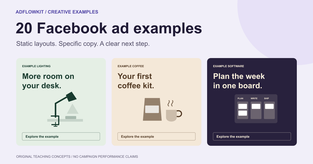
Each example includes a visual concept, sample copy and a reason to use it. These are original teaching examples for fictional businesses, not screenshots of live campaigns. Prices, features and service terms are illustrative. Use your own verified details; none of these layouts comes with a performance claim.
Choose your first example
- Selling a physical product? Start with one product and one benefit, then test a product-detail angle.
- Selling software? Show one readable part of the interface or one task the customer can complete.
- Booking a service? Name the service and area, then explain what happens after booking.
- Getting clicks but few customers? Check that your price, promise and next step match the landing page before changing the design.
Contents
The parts of a Facebook image ad
Plan the whole ad, including the text around the image. Someone who reads your headline should understand the offer even if they skip the primary text. Someone who looks only at the image should still recognize what you sell.
| Part | Its job | Desk lamp example |
|---|---|---|
| Primary text | Explain the situation, benefit and important conditions. | Make room for your notebook with a lamp that clamps to the edge of your desk. |
| Image | Show the product or service in a way the reader can recognize. | A lamp clamped to a desk, with the notebook and keyboard visible. |
| Text inside the image | Emphasize one idea if the design needs text. | More room on your desk. |
| Headline field | Name the offer or product below the image where the placement displays it. | Clamp-on desk lamp |
| CTA | Describe the next action using an available button option. | Shop Now, leading to the lamp's product page. |
Your image does not need to repeat the entire primary text. Put the essential idea in the creative and use the surrounding copy for context. Treat “one idea” as an editing rule: the product, headline and destination should support the same decision.
20 Facebook ad examples with copy and layouts
The visual concepts show the central image area, not a replica of Facebook's interface. Sample primary text and headline fields appear below each concept. Use the illustrated composition as a starting point, then replace the artwork with approved product photography or an accurate screenshot.
1. One product, one everyday benefit
More room on your desk.
Clamp-on desk lamp
Shop NowPrimary text: “Make room for your notebook. Our clamp-on lamp attaches to the desk edge, leaving the surface clear.” Headline: “A lamp for smaller desks.” CTA: Shop Now.
Use this when the product solves a visible, familiar problem. Photograph the lamp in place so the reader can see how the clamp saves desk space. Keep the notebook in the frame as context, with the lamp as the main subject.
Adapt it: For a bottle, demonstrate the lid; for a storage box, show where it fits. Replace “premium design” with a benefit someone can recognize. Lead to the exact item, including the dimensions and installation details that support your claim.
2. A product detail that answers a buying question
A pocket for your workday.
Separate padded laptop pocket
Shop NowPrimary text: “A separate padded pocket keeps your 13-inch laptop apart from keys and cables. See the pocket dimensions before you order.” Headline: “Meet the everyday work bag.” CTA: Shop Now.
Use a close-up when a feature matters more than the product's overall appearance. Show the open compartment and its construction. Keep any label beside the detail it describes, with enough contrast to read it on a phone.
Adapt it: Identify a question customers ask before buying: fit, closure, material or capacity. Show the answer. Do not promise compatibility with a device unless you have checked the measurements, including the case the customer may use.
3. A product in the situation it serves
Your morning. Ready to brew.
Choose beans or ground coffee
Shop NowPrimary text: “A coffee subscription for the way you brew. Choose whole beans or ground coffee and set a delivery schedule.” Headline: “Make the next cup yours.” CTA: Shop Now.
Choose this approach when the occasion helps explain the purchase. Show the bag of coffee beside a cup and the brewer. The customer should recognize both the product and the moment they would use it.
Adapt it: Use an actual setting your buyers recognize, such as a workbench or kitchen counter. Avoid a lifestyle scene in which the product becomes too small to identify. Keep subscription prices, delivery intervals and cancellation terms visible on the destination.
4. A review-led ad without an invented testimonial
Visual: Show the product beside a short, permissioned customer quote, or invite readers to see the reviews without quoting one. Primary text: “Compare the sizes, see the materials and read what owners say before choosing your work bag.” Headline: “Take a closer look.” CTA: Learn More.
Use this when buyers need reassurance from customers. Keep the quote in its original meaning and retain the source so your team can verify it. Do not create a person's name, portrait, star rating or quote to fill the layout.
Adapt it: If you have no usable review, show a product demonstration instead. A plain invitation to read genuine reviews is more defensible than a made-up endorsement.
5. An ad that addresses one purchase objection
Visual: A ceramic mug beside its protective packaging. Primary text: “See how we pack each mug for delivery, with a fitted insert around the handle and rim.” Headline: “Made with care. Packed with care.” CTA: Learn More.
Choose this after identifying a real concern from support conversations or abandoned-checkout feedback. Explain what you do about the concern. A photograph of the packaging provides more information than a badge that says “trusted quality.”
Adapt it: Answer one objection at a time: setup, sizing or delivery. Link to a page that explains the relevant process. Packaging alone does not support a promise that damage can never occur.
6. Clear subscription pricing
$18 a month.
One box. Delivery included in the contiguous US.
Learn MorePrimary text: “One monthly stationery box for $18, with delivery included in the contiguous US. Pause future boxes before the next billing date.” Headline: “Your monthly desk refresh.” CTA: Learn More.
A price-led ad can help people assess whether the offer fits their budget before clicking. Make the billing interval as readable as the price. In this fictional example, “a month” and the delivery area are part of the offer.
Adapt it: Replace the sample terms with your actual price, currency, shipping and renewal conditions. If a trial converts into a subscription, explain that transition. Do not describe the first discounted payment as the ongoing price.
7. A starter kit with visible contents
Your first coffee kit.
Beans + scoop · $28
Shop NowPrimary text: “Start with one bag of beans and a measuring scoop. The $28 starter kit includes both; choose your grind on the product page.” Headline: “Your first coffee kit.” CTA: Shop Now.
Use a kit when customers need help deciding what to buy together. Arrange the included items so each is recognizable. Give the kit one name and one total price; list any optional accessories separately on the page.
Adapt it: Explain what is included before claiming value. A bundle is not automatically a discount. Only add a saving when you can substantiate the comparison against the relevant individual prices. If you plan a Black Friday bundle, use the Black Friday banner examples to compare product, bundle and delivery offers.
8. A small choice guide
Visual: Three notebooks with labels: “Daily notes,” “Project plans” and “Sketches.” Primary text: “Choose a notebook by what goes inside it. Compare lined, dotted and plain pages in the collection.” Headline: “Find your next notebook.” CTA: Shop Now.
Choose this for a small product range with meaningful differences. Labels should explain the choice, rather than add decoration. Keep the items large enough to identify; a single image with many tiny products makes comparison difficult.
Adapt it: Send the reader to a filtered collection or comparison page containing the same options. If people need several images to evaluate the products, consider a carousel as a separate format rather than squeezing a catalog into one static image.
9. A local service with a named area
Oven cleaning in Bristol.
Check your postcode and choose a visit
Book NowPrimary text: “Book an oven clean in Bristol. Check your postcode, see what's included and choose an available visit.” Headline: “Oven cleaning in Bristol.” CTA: Book Now.
For a local service, start with the service and the area you cover. Show a real member of the team or the equipment used for that job. A recognizable task and a location tell the reader more than “Your trusted local experts.”
Adapt it: Link to a booking page with coverage, exclusions and pricing information. Use Book Now when people can book; use Learn More when they first need a quote. Do not advertise availability you cannot offer.
10. A service process that reduces uncertainty
Visual: Three short steps: “Choose a visit,” “Meet the cleaner,” “Check the work.” Primary text: “Choose a cleaning visit online. We'll confirm the appointment and tell you how to prepare the room.” Headline: “Know what happens next.” CTA: Learn More.
Use this when the first booking feels complicated. Explain the customer's next steps in ordinary words. The ad should help them picture the appointment, without promising a result your team has not assessed.
Adapt it: Match the steps to your real booking process. If you must inspect the property before quoting, show that step. An ad that promises instant booking should not lead to a long request form with no appointment options.
11. One readable software screen
Plan the week in one board.
Tasks, owners and deadlines together
Learn MorePrimary text: “Keep the next task, owner and deadline together. Build a shared project board and see what your team plans to do next.” Headline: “Plan the week in one board.” CTA: Learn More.
Use a screenshot when the interface explains the benefit. Crop to the task list or board that matters, using sample data and removing customer information. A full desktop screenshot usually contains more detail than a phone-sized ad can show.
Adapt it: Put one readable section in the image. The diagram here illustrates a board layout; your ad should show your actual product. If the workflow needs motion or several steps to explain, test a demonstration format separately.
12. Software copy built around a job
Visual: A sample invoice beside a payment-status panel. Primary text: “Create an invoice, send it to your client and check its payment status from the same workspace.” Headline: “From invoice to payment status.” CTA: Learn More.
Choose this when readers may not know your software category. Name the task they need to complete before listing features. Show a realistic sample that supports the claim, with no private financial or customer details.
Adapt it: Replace broad promises such as “transform your workflow” with a supported action. Do not add an exact time saving or revenue gain without evidence. The landing page should demonstrate the same task and explain which plan includes it.
13. A useful downloadable resource
Visual: A legible preview of a one-page project brief. Primary text: “Use one page to agree on the goal, audience, deliverables and deadline. Download the project brief template.” Headline: “Start with a clearer brief.” CTA: Download.
Use this to reach people who need guidance before they need your product. Show part of the resource so readers can judge whether it is useful. Name the file or resource instead of calling it an “exclusive solution.”
Adapt it: If the destination asks for an email address, say so before the form. Deliver the promised resource after submission. Measure the quality of the resulting leads, rather than treating all downloads as equally valuable.
14. A workshop with a specific learning outcome
Visual: The speaker and a sample launch-planning worksheet. Primary text: “Build a launch plan with a goal, an owner for each task and a first-week checklist. See the live workshop dates and agenda.” Headline: “Plan your first product launch.” CTA: Learn More.
A workshop ad should explain what an attendee will learn or leave with. Show the actual host if you have permission and use an agenda that reflects the session. Place the schedule and time zone on the registration page.
Adapt it: Add the date to the creative when promoting one scheduled session. Remove expired ads after the event or switch the destination and copy to the recording. Avoid “last seats” unless you have a real limit and an accurate count.
15. A problem stated without labeling the reader
Visual: Project notes organized into named folders. Primary text: “A shared place for meeting notes, decisions and next steps. Keep the project context beside the work.” Headline: “Give project notes a home.” CTA: Learn More.
Use this to describe a situation your product addresses. Talk about the task instead of making assumptions about the person reading the ad. “Meeting notes across several folders” describes a workflow; “You're a disorganized manager” attacks the reader.
Adapt it: Ask what changes in the customer's working day, then show that change. Keep the language specific enough to recognize and respectful enough that a new reader can consider it without feeling accused.
16. A visual comparison of two workflows
Visual: The same sample tasks in a long list and in a board grouped by owner. Primary text: “See your tasks by owner instead of searching through a shared list. Compare the board view with your current setup.” Headline: “One project. A clearer view.” CTA: Learn More.
Use a comparison when readers can evaluate a concrete difference. Keep the sample information the same on both sides so you show a change in organization, not a different amount of work.
Adapt it: Explain what the comparison does and does not demonstrate. A tidier sample board is not proof that every team will finish faster. Avoid manufactured health, appearance or financial transformations; this example concerns task organization.
17. A new arrival with a visible difference
Visual: A new lamp finish beside the existing finish, photographed under the same light. Primary text: “The desk lamp now comes in warm white. Same clamp fitting; a new finish for your workspace.” Headline: “Meet the warm white finish.” CTA: Shop Now.
Choose this when you have a specific product update, rather than a vague reason to announce your brand again. Make the new detail obvious and keep the product recognizable.
Adapt it: For software, show the new control or view; for clothing, show the new fabric or cut. Only call an item “back in stock” if customers can order it. Link to the announced variation, not an unrelated category page.
18. A delivery or returns explanation
Visual: The packaged product with a short delivery-area label. Primary text: “Ordering a notebook as a gift? See delivery options and the returns policy before you choose.” Headline: “Plan the gift before checkout.” CTA: Learn More.
Use this when logistics are part of the decision. State a real service condition, such as the delivery area or the return window, only when the relevant details support it. Keep exclusions legible and easy to find on the destination.
Adapt it: Do not promise arrival by a holiday from an estimated shipping time alone. Distinguish dispatch from delivery and make any order cut-off clear. A reusable policy explanation often needs less urgency than a promotion. The Christmas ad examples show delivery-deadline ads for each stage of December. For the wider holiday campaign, the Christmas social creative ideas offer directions for Stories, Reels and short videos.
19. A product reminder without intrusive copy
Visual: The product with two useful details, such as capacity and dimensions. Primary text: “Take another look at the everyday bag. Compare colors, check the laptop pocket and choose your size.” Headline: “Find the right fit for your day.” CTA: Shop Now.
Use this for an eligible remarketing campaign when the customer may already know the product. Supply information that helps finish the decision. You do not need a line such as “We saw you browsing this bag” to make the product relevant.
Adapt it: Use the audience options available to your account and follow the applicable consent and platform requirements. Stop showing an unavailable offer. Consider whether people who already purchased need a different message.
20. A direct brand introduction
Visual: A small selection from the product range, with the brand name and a plain category description. Primary text: “Notebooks for daily notes, project planning and sketches. Explore the paper types and choose the format you will use.” Headline: “Paper for the way you work.” CTA: Shop Now.
Choose this when the audience has never heard of the business and needs to understand what it sells. Show enough of the range to explain the category, while keeping one product or group as the focal point.
Adapt it: Replace an unexplained slogan with the category and its use. A distinctive visual style can help recognition, but it cannot explain an unfamiliar product on its own. Let the destination continue the introduction with the same range.
Which Facebook ad example should you use?
Choose the example that answers the customer's next question. A new visitor may need to know what the product is. A visitor comparing two bags may need the pocket measurements. Someone booking a cleaner may want to know whether you cover their postcode.
| Customer question | Start with | Useful destination |
|---|---|---|
| What do you sell? | Product benefit or brand introduction | A focused product page or collection |
| Will it suit my use? | Product detail, screenshot or choice guide | Dimensions, demo or comparison |
| What will it cost? | Clear pricing or a kit | The actual price and purchase terms |
| What happens after I book? | Service process | Coverage, steps and booking options |
| Can I trust the offer? | Verified review or an objection answer | Genuine evidence and the relevant policy |
You can test more than one answer, but keep the purchase stage in mind. An educational download and a direct product sale ask for different commitments; compare each against its own goal.
Turn a vague Facebook ad into a specific one
Vague version: “Upgrade your lifestyle with our premium bag. Amazing quality. Shop now.” This gives the reader little to evaluate. “Premium” does not identify the material, capacity or use.
Specific version: “Keep your 13-inch laptop in a separate padded pocket. See the everyday bag's dimensions and colors.” Use a photograph of the open pocket, the headline “Your workday, packed” and a Shop Now button that opens the bag page.
The second version makes a checkable promise. It also gives the designer a subject: the pocket. If the product cannot support that claim, choose another benefit. A stronger ad starts with a more useful fact, not a louder adjective.
Adapt the design for Facebook Feed and Stories
Design for the placement you intend to buy. A square or portrait feed composition and a full-height Stories composition need different arrangements of the product and headline. Use your Ads Manager preview and the Meta Ads Guide to confirm which ratios and assets your selected placements accept. Some guide pages require a Facebook login.
For a feed concept, keep the product large and the headline near it. For a Stories adaptation, recompose the product and copy within the tall frame, away from interface overlays. Do not stretch the square or add empty space and assume the result is ready.
Read the text at the size someone will see on a phone. Move long explanations into the primary text or destination. Check each preview for clipped product edges, hidden logos and cropped conditions. Our Meta ad sizes guide covers placement dimensions and cropping in detail.
The CTA-shaped label in a sample image is part of the artwork. The actual platform button is separate, and its label depends on the options available for your ad setup. Keep both consistent with the next step.
Find and study real Facebook ads
Use the Meta Ad Library to search by advertiser or keyword in the country you want to study. Meta's explanation of the library describes its inclusion of active ads from Pages. The library is a source of real creative examples; it is not a public ranking of ads by sales.
- Pick a few businesses serving a similar customer or selling a comparable product.
- Record the advertiser, date you viewed the ad, library ID when available, copy, format and destination.
- Write down the offer, the visual subject and the action the ad asks for.
- Open the destination and check whether it continues the same promise.
- Turn an observed pattern into your own brief using your product facts and approved assets.
An active label or an old start date does not establish profitability. You do not know an advertiser's costs, targeting, conversions or test design from a screenshot. Describe what you can observe, such as “the ad shows the pocket,” instead of claiming “this pocket image increased ROAS.”
Use competitors' work for analysis. Create your own copy and visuals rather than republishing their images as your campaign.
Make your own version and test the message
Before writing your brief, use our banner design inspiration gallery to choose a color treatment, product composition or illustration style. Adapt that direction to your brand and Facebook placement.
Write a short brief before opening the design tool. For the bag example, a useful brief looks like this:
Product: everyday work bag with a separate padded laptop pocket
Customer task: carry a 13-inch laptop and daily essentials
Verified point: pocket dimensions fit the named device
Message: keep the laptop apart from loose items
Visual: approved photo of the open pocket
Primary text: explain the pocket and invite a dimension check
Headline: Your workday, packed
Destination: the exact bag page
CTA: Shop Now
Test question: does the pocket detail or the bag-in-use image help more buyers?
AdflowKit can start from a landing-page URL or a text brief and help create banner layouts with your logo. Review its proposed copy, product representation and placement crops before export. Use an approved product image when the item must match a specific SKU; an AI-generated scene can change details. The AI banner prompt guide explains how to turn your product facts into a prompt with a clear scene and message.
For the first comparison, keep the offer and destination consistent and change a meaningful element, such as the product detail versus the in-use photograph. Use the platform's experiment tools when they fit the question. Two ads receiving different delivery inside a campaign do not automatically form a controlled experiment.
Record the question, audience, destination and version names. For a sales ad, evaluate purchases and acquisition cost against your margins. For a service, check qualified bookings and whether the team can fulfill them. Use click-through rate to investigate interest, while checking what people do after the click.
Choose the amount of evidence you need for a decision before you spend. There is no universal number of days or conversions that proves a Facebook creative works. The A/B testing guide explains test design; the creative fatigue guide covers when to revisit an established message.
Before you publish your Facebook ad
- A reader can identify the product or service from the image and opening line.
- The creative presents one main reason to consider the offer.
- Prices, product details, review quotations and service promises are accurate.
- The CTA matches the action available on the destination.
- The landing page shows the advertised item, conditions and current availability.
- The placement previews preserve the product, headline and essential terms.
- The ad uses approved images and contains no customer information.
- You have checked the current platform requirements and the ad's review status.
- You can identify the version and its goal in your campaign report.
Facebook ad examples: common questions
What is a good example of a Facebook image ad?
A product photo that demonstrates one benefit, supported by a clear offer and a matching CTA. For example, show a clamp-on lamp leaving room on a desk, explain the fitting in the primary text and link to that lamp's page. The quality of the idea still needs validation in your campaign.
Which Facebook ads perform best?
No layout wins for every business. The offer, audience, product, destination and delivery all affect results. Start with the example that answers a real buying question and compare it against another specific message using your own customer outcomes.
Do static image ads still make sense alongside video?
A static image can communicate a product, price or detail in one view. A video can demonstrate movement or a sequence. Choose based on what the customer needs to understand, then compare the formats if your campaign can support a useful test.
Can I use these examples for Instagram?
You can adapt the message and visual idea. Prepare the composition for the selected Instagram placement and inspect its preview; Facebook and Instagram placements do not necessarily display the same crops or surrounding text.
How much text should I put in the image?
Use enough to communicate the central idea at phone size. There is no need to put the full primary text inside the artwork. Keep necessary conditions legible and check the current requirements for the ad and placement you select.
Are the examples in this article real campaigns?
No. They are original educational concepts with illustrative copy and terms. To study live advertiser creatives, use the Meta Ad Library. The article makes no claims about the examples' CTR, conversion rate or ROAS.
Editorial review: October 20, 2026. The examples are original teaching concepts. Meta's Ads Guide links may require login; confirm current placement requirements in the guide and your account before launch.