
Black Friday ad creatives: examples for Google and Meta
Planning a 2027 campaign? The 2027 marketing calendar lists next year's November dates and preparation windows. This creative guide uses 2026 dates.
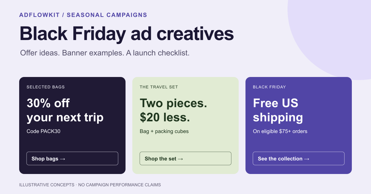
To make Black Friday ad creatives, start with one specific offer, show the product it applies to, and prepare a layout for each placement. Keep the discount, eligibility and end date consistent from the banner through checkout. Below are five illustrative banner concepts, a sample creative brief, and separate production checklists for Meta, uploaded Google Display ads and Performance Max.
Key takeaways
- Write the offer before designing: product, saving, exclusions, code and deadline.
- Prepare finished ads and clean image assets separately. Google combines responsive-display and Performance Max assets with text; a finished Meta banner needs a different treatment.
- Test a message you can identify. Changing the discount, audience and layout together makes the result hard to explain.
- Schedule the end of the promotion. Remove expired copy from ads, automated assets and the destination page.
Contents
Black Friday 2026 dates and a production plan
In the US, Black Friday falls on November 27, 2026, followed by Cyber Monday on November 30. Black Friday is the day after Thanksgiving; the US Office of Personnel Management calendar lists Thanksgiving on November 26 this year.
You can run an earlier sale, but state its actual dates. Adobe's 2026 holiday shopping forecast points to shoppers seeking early discounts in October. That provides seasonal context, not a reason to assume your own customers will buy on a particular day.
The schedule below is a planning example. Adjust it to your stock, approval process and campaign history. Google or Meta does not require this production schedule.
| Stage | Prepare | Decision to finish |
|---|---|---|
| Offer planning | Eligible products, margins, stock, code and landing page | Which products and customers qualify? |
| Creative production | Master design, message variations and placement layouts | Can you read the offer at the size people will see? |
| Before launch | Ad previews, review status, checkout checks and campaign dates | Do the ad and purchase path show the same deal? |
| During the sale | Stock, delivery promises, spend and purchase tracking | Can you still fulfill the advertised offer? |
| At the deadline | Ad end times, replacement copy and destination updates | Have you removed expired claims everywhere? |
Leave time to fix review issues before your planned launch. Uploading an ad does not guarantee approval or delivery by a chosen hour.
Define an offer you can deliver
Write a short offer sheet that your designer, media buyer and store operator can use. Include the eligible collection, discount calculation, exclusions, minimum spend, code, start and end time, time zone, and where the customer redeems it.
For example: 30% off selected travel bags, code PACK30, November 27–30, ending at 11:59 p.m. Eastern Time on November 30. This is a fictional offer for the examples in this article. It is not an AdflowKit promotion or a measured campaign result.
Check the details in checkout with an eligible item and an excluded item. For percentage savings, confirm the reference price and the amount a customer pays. For a bundle, compare equivalent items. If you advertise a shipping threshold, say which destinations qualify and check whether the threshold applies before or after discounts.
Put material limitations close to the offer. If only selected products qualify, include “selected” in the headline or the nearby supporting copy. A link to lengthy terms cannot repair an image that promises a different deal.
Five Black Friday banner examples to adapt
These examples show possible message and layout choices. The numbers are placeholders: replace them with your approved offer. They are not examples of campaigns with proven conversion rates.
BLACK FRIDAY
30% off
selected bags
Code PACK30 · Nov 27–30
Shop bags →THE TRAVEL SET
Two pieces.
$20 less.
Bag + packing cubes · Nov 27–30
Shop the set →BLACK FRIDAY
Free US shipping
on $75+
Eligible contiguous-US orders · Nov 27–30
Shop the collection →EARLY ACCESS
Members shop
the sale first
Early access starts Nov 25
Get early access →SELECTED BAGS
30% off
ends tonight
Nov 30, 11:59 p.m. ET · Code PACK30
Shop before it ends →Finished-ad layouts for illustration. Supply separate clean photography for responsive display assets; see the platform checklist below.
1. A specific discount on a specific collection
Sample copy: “30% off selected bags.” Supporting line: “Code PACK30 · Nov 27–30.” CTA: “Shop bags.”
Make the saving and eligible product the first things you see. Place one product photo beside the text, with the code and dates underneath. Link to the discounted collection so a customer can find a qualifying bag without searching the whole catalog.
Use this concept when your offer applies to a defined range. If only one item has the largest saving, avoid presenting that percentage as the discount on the entire collection.
2. A bundle with a clear comparison
Sample copy: “The travel set: save $20.” Supporting line: “Bag + packing cubes · Nov 27–30.” CTA: “Shop the set.”
Show the included items together and name both. On the landing page, explain the bundle contents and the prices you used to calculate the saving. Choose this layout when seeing the items together helps a customer understand the offer.
A bundle needs enough space to show its contents. In a narrow banner, simplify the image and keep the saving legible rather than shrinking a detailed product collage.
3. A shipping offer with a visible threshold
Sample copy: “Free US shipping on $75+.” Supporting line: “Eligible contiguous-US orders · Nov 27–30.” CTA: “Shop the collection.”
Keep the threshold in the main message. Use this concept only if the offer matches your shipping setup. Show eligible destinations, exclusions and any minimum spend on the destination page. Do not use “free shipping” as the headline while hiding a substantial threshold in unreadable text.
4. Early access for a defined audience
Sample copy: “Members shop the sale first.” Supporting line: “Early access starts Nov 25.” CTA: “Get early access.”
Send people to the access or signup page that the CTA describes. Explain who qualifies, whether membership costs anything, and when the public sale starts. Use a separate version for the public launch so the access message does not outlive its purpose.
5. A reminder with a real deadline
Sample copy: “Selected bags: 30% off ends tonight.” Supporting line: “Nov 30, 11:59 p.m. ET · Code PACK30.” CTA: “Shop before it ends.”
Use this version only during the period in which “tonight” is accurate for the audience and the stated time zone. Set its end time, including on reused ads. For audiences in several time zones, an explicit date and time can be clearer than “tonight.”
For an animated offer, use a readable end-date frame and follow our HTML5 banner animation guidance. A live countdown needs custom implementation and a genuine deadline; the standard entrance effects do not create a timer.
Do not add a timer that resets for each visitor or a deadline you plan to ignore. The FTC's report on dark patterns identifies false countdowns as a tactic that can mislead shoppers.
What to make for Google Ads and Meta
Decide where each export will go before adding text or drawing a button. A finished banner and an image asset serve different jobs.
| Ad type | Creative to prepare | Check before upload |
|---|---|---|
| Uploaded Google Display ad | A finished banner with the offer, brand and CTA | Accepted dimensions, file format, weight and account eligibility for HTML5 |
| Responsive display ad | Clean product or lifestyle images, with text and logos supplied separately | Avoid added text, logo and button overlays in the image |
| Performance Max | Images, logos and text assets for the asset group | Google allows overlays with limitations and recommends at least one image without overlays per aspect ratio |
| Meta image ad | A finished visual adapted to the selected placements, plus primary text and the platform CTA | Placement previews, crops and interface overlap |
Google's responsive display best practices advise against overlaid text and logos and against adding button graphics. Its Performance Max image guidance treats overlays differently. Follow the guidance for the specific ad type instead of applying one rule to all Google images.
For finished Display banners, use the Google Display banner sizes guide and Google's uploaded display ad specifications. For Meta, prepare separate square, portrait-feed and full-screen compositions as needed; the Meta image sizes and safe-zone guide covers placement details. Treat those as layout decisions rather than exporting one design and trusting an automatic crop.
Preview the smallest version at its actual display size. If you cannot read the offer, remove secondary copy or simplify the layout. Keep essential conditions readable; move fuller explanations onto the destination page without contradicting the banner.
A Black Friday creative brief you can copy
For more visual directions to explore, see our creative banner design ideas: product-matched backgrounds, type hierarchy and compositions adapted to different formats.
Give your designer or banner tool the same source facts you gave the person configuring the sale. Replace the fictional details below before generating a real campaign.
Campaign: Black Friday travel bags
Audience: US shoppers looking for travel bags
Offer: 30% off selected bags
Code: PACK30
Dates: Nov 27–30, 2026; ends Nov 30 at 11:59 p.m. ET
Exclusions: full-price new arrivals; no stacking with other codes
Destination: the collection page listing eligible bags
Headline: 30% off selected bags
Supporting copy: Code PACK30 · Nov 27–30
CTA: Shop bags
Brand: use the supplied logo, colors and product photography
Finished ads: Google Display sizes and selected Meta ratios
Separate assets: clean photos for responsive display and PMax
Avoid: invented badges, ratings, scarcity or product features
If the tool cannot render a line accurately, edit that text before export. Inspect dates, punctuation, product details and the code in each layout. AI-generated photography can change a product's appearance; use approved product images when the ad needs to represent a specific SKU.
AdflowKit can start from a landing-page URL or a brief and produce banner layouts with your logo. Review the generated copy, select the required formats and edit the design before export. For asset-based Google campaigns, prepare clean images separately and check them against the platform guidance above. The banner prompt guide explains how to give the tool a more specific brief.
Test variations without losing the comparison
Choose a question before making variants. For example: does “30% off selected bags” or “Pack for your next trip, for less” communicate the same offer more clearly? Keep the actual deal, destination and visual treatment consistent for that comparison. Then test a different product image in a separate comparison.
Assign names you can recognize in a report, such as bf26_bags_discount_square_v1 and bf26_bags_travel_square_v1. Record the message, image and destination with each version. A resized copy of an ad is a placement adaptation; it does not by itself test a new creative idea.
Agree on the purchase metric and spending limits before launch. Compare purchases, cost per purchase and revenue against your margin goals. Click-through rate can help diagnose a message, but a banner with more clicks may attract fewer buyers. Check tracking and checkout if clicks continue while purchases fall.
Campaign delivery, audiences, budgets and inventory can change during a sale. Do not treat a small difference between two ads as proof of a winning design. Use a platform experiment where it fits your campaign and allow enough evidence for the decision. Our guide to A/B testing ad creatives covers how to structure the comparison.
Mistakes to catch before launch
- A broad promise with narrow eligibility. Replace “30% off everything” if new arrivals, brands or categories do not qualify.
- A code that fails in checkout. Test dates, eligible items, minimum spend, stacking and the customer's region.
- A product the customer cannot buy. Check stock, variants and the destination before increasing delivery.
- Unreadable offer conditions. Shorten the message and inspect actual-size previews instead of relying on a large design canvas.
- One finished banner uploaded as every kind of image asset. Keep clean photography and finished-ad exports in separate folders.
- Sale copy left inside automation. Review generated text and destination settings that could reuse an old promotion.
- An unsupported performance claim. Treat a layout as a hypothesis until your own campaign supplies evidence.
Google's responsive display guidance also calls for the landing page to reflect the advertised promotion. If an ad receives a rejection, identify the policy in the account before rewriting the whole campaign. The banner disapproval guide explains that workflow.
The launch and shutdown checklist
Before you launch
- Approve the offer, eligible products, exclusions, code and deadline with a named owner.
- Test the advertised deal through checkout on a phone.
- Check each placement preview for clipped text, hidden logos and interface overlap.
- Use the correct export type for each platform and ad type.
- Confirm the ad destination, tracking parameters, purchase tracking and consent behavior.
- Review ad status and allow time to address policy feedback.
- Set campaign dates and confirm how the account time zone maps to the advertised deadline.
During the sale and at the deadline
- Watch stock and fulfillment capacity; update ads if the advertised product or promise changes.
- Check purchases and margin alongside clicks and spending.
- Pause expiring ads and remove outdated promotion assets at the stated end time.
- Inspect scheduled posts, automated text, retargeting ads and reused creatives for old claims.
- Update the destination page and verify that checkout no longer offers an expired deal.
- Save results with the exact offer and creative version for your next seasonal campaign.
Once Cyber Monday ends, switch to gift guides, delivery deadlines and last-minute offers. The Christmas ad examples cover that period, with 44 banners and a 2026 date plan.
Black Friday ad creative FAQ
When is Black Friday in 2026?
Black Friday is November 27, 2026. Cyber Monday follows on November 30. If your sale starts earlier or finishes later, display your own dates and time zone.
What should a Black Friday banner include?
Show the product or collection, the specific offer, your brand and a relevant call to action. Include material conditions such as selected-item eligibility, a minimum spend, a required code or the deadline where the customer can read them.
Do Black Friday ads have to use black and red?
No. Keep your brand recognizable and use enough contrast to make the offer readable. Black and red are a design choice, not a platform requirement.
Can I reuse a Meta sale banner in Google Ads?
You may adapt a finished design for an uploaded Display ad if it meets the specifications. For responsive display, supply clean images and separate text and logo assets. Check Performance Max's own overlay guidance before reusing an image there.
How many creative variations should I make?
Base the number on the messages you need to compare, the placements you use and your ability to collect useful results. Start with a manageable set, distinguish message tests from size adaptations, and avoid splitting a small budget across more variants than you can evaluate.
Can AI create my Black Friday ads?
AI can draft layouts and copy from an approved brief. You still need to verify the offer, product representation, dates, code, eligibility and placement previews. A generated banner does not guarantee policy approval or campaign results.
Sources checked October 19, 2026. Platform guidance can change; check the linked documentation and your account previews before launch. All creative examples in this article are illustrative.